
Inspired by reading a blog post from my old colleague CMS about the closure of the IMDb Message Boards, I thought it could be fun to talk about the development of IMDb back then from a designers point of view.
As CMS I too was really excited when I joined IMDb coming from a job in HP-Labs Bristol where a few of us originated from. I wasn't as such a movie buff, a database nerd or a code monkey, but I loved using my photoshop skills to make gif files and to make cool looking web pages.
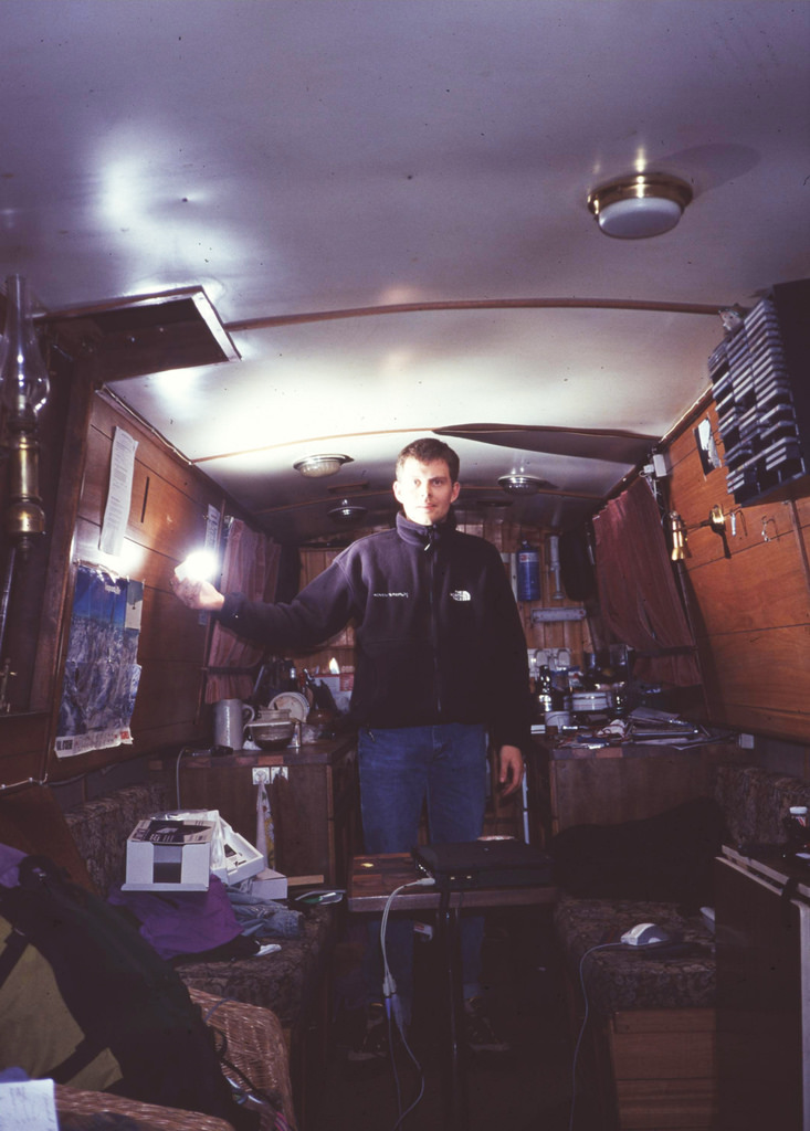
At the time I lived on a narrowboat in the harbour of Bristol. As we worked all worked from home getting me hooked up with a fixed telephone line and an ADSL modem proved the first interesting challenge. BT eventually came and installed a phone plug on the side of the harbour pier and I could plug my boat into the internet then when moored up.
It was key for the job also to take part of the content editing - a constant challenge because of the volume. The data was only increasing and the team constantly stretched. I didn't really have any film background and as such I was given the Biography section to maintain. This proved really challenging for me mainly because there were no tools as such to view, edit or approve the submissions. So I had to learn UNIX and vi. I ended up enjoying the data approval a lot as it gave structure to an otherwise chaotic workflow. It helped me getting into the core of the product and the intention was that I was going to be the guinea pig for development of actual content manager tools as well as the designer of these.
Looking back at it I think it was a really smart thing to have me being "part of the team" in this sense - I was the only designer at the time and the rest of IMDb was all developers or content geeks. Over the years I have come to appreciate knowing my way around UNIX and also have the rare skill of editing in vi!
As with the design CMS mentioned the workflow somewhat: for the complicated and intricate table structures that I was keen on (right hand and left hand side columns, complex headers etc) I was used to using front end tools like Adobe PageMill or Microsoft FrontPage. Both these tools sucked as they always turn any neat html code into crap with their own tagging. It was a real breakthrough the day DreamWeaver was released and finally there was a tool where I could alter the other guys code and fiddle with the layout in my WYSIWYG view and then send the code back to them with only gif files and table structures altered. CSS stylesheets were still not around out at that time.
I found the way of working really efficient. Minimal waste on transport (getting up from bed to the computer) and being able to work on tasks rather than clocking time in an office. I found the solitude of working from home a bit limiting and I eventually got a office desk at the local art cinema to make sure I kept fresh in my designs. Also this created an opportunity to test some of the ideas on "other people" which was a new thing at the time.

IMDb Design Office 1999

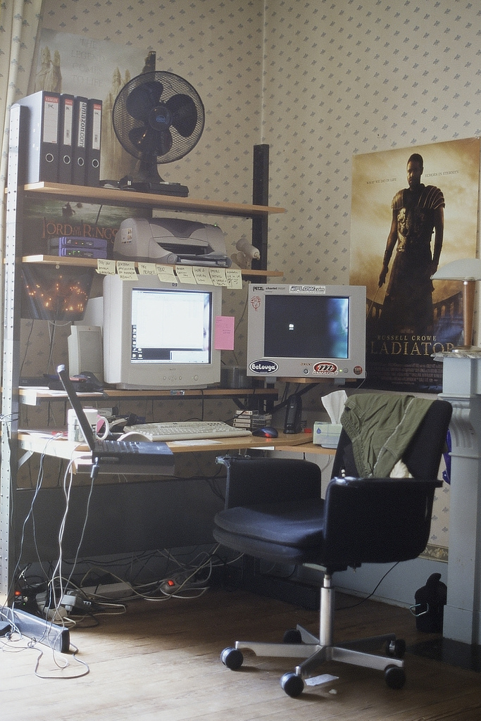
IMDb design office 2000
I remember the message boards as a fun project. CMS describes well why we wanted to "re-do" them and I remember that we wanted to throw in some additional smileys for people to use as a sort of compensation to the change aggression we knew we would get. We had a base set and I made a few more up. Can't believe that "Mjyeds" still survives to this day and also the "caver" which is a personal favorite of mine. I'd imagine it's pretty low on the usage statistics. I had made it for my personal website and I suppose I thought it should make its way to IMDb.
When looking at the smileys today I suppose a lot of them wouldn't make it to Facebook's "like, wow or love" buttons. We had "sniper", "Machine Gun" and "knife through head".
I also worked on the project Mayhem which essentially was the new IMDbPro subscription website. Most of us who came from HPLB was serious web-should-be-free types and this was my first exposure into the other parts of the teams from Seattle who wanted bigger banners, forced credit-card for sign-up, automatic subscription renewal etc. I tried my best to fight to keep everything free - litte did I know that IMDbPro was exactly that tool to make the rest of IMDb remain free - still today. The design was affected by my colleagues in US from business development and as I came from a pure research background this was really hard to accept. We did eventually come to terms with the design after I had spent 2 months co-located in Seattle in the same room as my counterparts. We never really agreed with design vs. biz interests but we became pretty good friends. I'm sure it must have been extremely frustrating for them to have a vocal and stubborn single designer who thought he had all the right answers.
We made t-shirts and all sorts of promo materials for the launch and met all the subscription targets that were set. I'm pretty proud to have been part this section of IMDb.
On the back side of things we worked on making the content management user friendly. I worked with 3 ex colleagues from HP and we were a pretty solid team for the daunting task. I was still editing every bit of submitted data in the raw txt files with vi so any improvement was saught after. We managed make a neat web-based system for the time where it was possible to checkin/out bits of data, search, and generally handle the data in a more friendly manner. Over time this enabled more film nerdy folks to enter the content team and less computer geeks.
From a design point of view I remember one of my big frustations was with the accronym IMDb and the way we spelled it with a miniscule b. Graphically it was difficult to distinguish the letters from eachother and phonetically it was even more difficult. I made numerous proposals to change the logo to a more readable font, and to have the title spelled out in the logo instead of the letters. In the end we kept the IMDb in the good old Impact Font and still to this day it remains the same. Glad I didn't change it.
At the last round of my work at IMDb we started playing around with a Palm Pilot version of the site: imagine being able to access the site from the palm of your hand. It seemed pretty futuristic at the time and indeed it took a good shake up from Apple to make this a reality.
I've followed the design of IMDb since I stopped and I have been really pleased with how the focus has seemed to be developing for new and more platforms and keeping the core site more or less stable with only minor tweaks in the design. The phone/tablet version of IMDb totally rocks and it seems to have become more mainstream than when I was there.
It was a really exciting time to work for IMDb. We moved from total individual autonomy to meeting at regular Wednesday lunches to now today they actually have offices. I personally loved the freedom and something I have kept in my employments since. But I also realised the limitation of it - it was difficult for me as a designer to really innovate with the developers without meeting with whiteboards, coffee and other good tools to be together.